
Get started with PriceLabs now!
Want to learn what PriceLabs can do for you? See for yourself with a free trial. Get started now!

Your calendar just went quiet and an owner wants to know why by Friday. Before you tell them the market is soft, pull the numbers first. A real booking curve analysis for vacation rentals tells you whether guests are booking slower everywhere in your market, or whether a rule you set on your own calendar is quietly turning bookings away.
That distinction changes what you do next. Chase a market slowdown with a discount, and you leave money on the table if demand was fine all along. Ignore a property restriction that is actually the problem, and you keep losing bookings while blaming a market that never moved.
This guide covers what a booking curve measures, how to separate market-level pacing from your own settings, and the restrictions that most often get blamed on demand. We also cover how PriceLabs Market Dashboards turn this comparison into a five-minute check instead of a guessing game.
A booking curve maps how far in advance guests reserve a property before check-in, showing whether bookings are pacing normally, running behind the local market, or slowed by a property-level rule such as a minimum stay. Comparing your property's curve against the market curve for the same dates is the fastest way to tell a real demand shift from a self-imposed restriction.
A booking curve is your reservations plotted against lead time, the number of days between when a guest booked and when they check in. Stack curves from past years or from your competitive set on the same chart, and gaps become obvious.
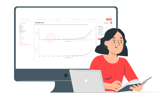
Three things show up clearly in a good booking curve: how early guests in your market typically book, whether your calendar is filling at the same pace as similar listings, and where your occupancy rate, ADR, and RevPAR sit relative to that pace. None of these numbers mean much on their own. They mean something once you compare your property against the market.
A shrinking booking window shows up as a curve that starts flat and then spikes late. A property with an overly strict minimum stay shows up differently: a curve that stays flat all the way to check-in, because short stays that would otherwise fill the gap are blocked from booking at all.
Market-level pacing follows predictable cycles. High season books out months ahead. Shoulder season fills closer to check-in. A local festival or conference can spike demand for a specific week regardless of what any single host does. These are patterns everyone in the market feels, whether or not they use dynamic pricing.
Property-level restrictions are different. They are rules you or a predecessor set, and they suppress bookings regardless of what the market is doing. A strict minimum stay blocks short trips even when demand is strong. A rigid check-in day rule turns away guests who would have booked around it. Minimum stay restrictions are the single most common setting we see property managers misdiagnose as a soft market.
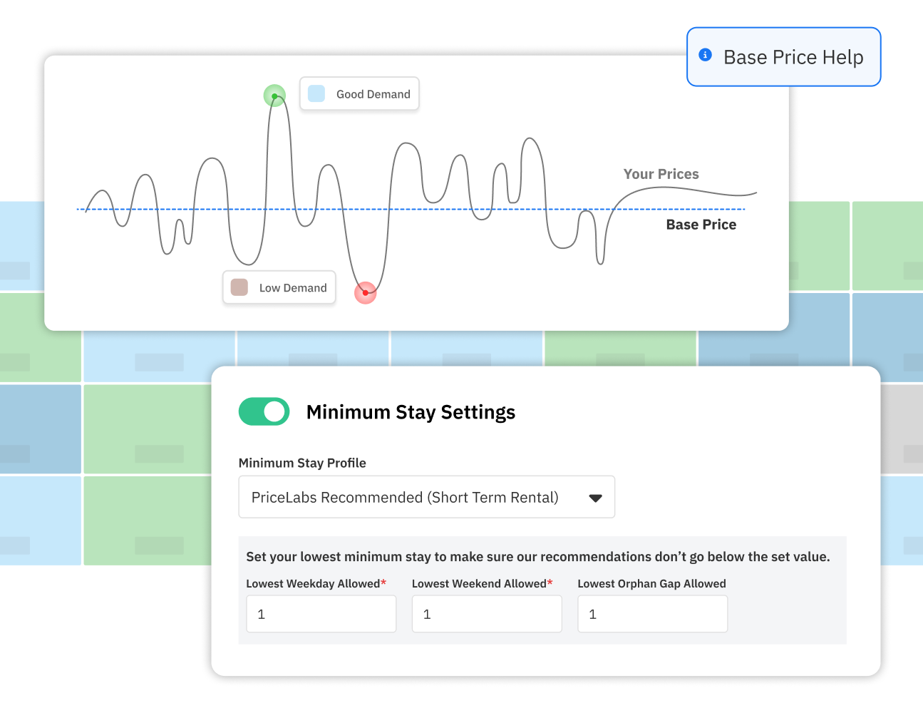
The test is simple. If the market curve is healthy and your curve lags behind it at the same lead time, the problem is very likely sitting in your settings, not in guest demand.
Take a property manager running twelve units who noticed weekend bookings drop. The market curve on Market Dashboards showed demand holding steady, so the market was not the problem. Pulling the property curve showed a flat pace through the final two weeks before check-in, the signature of an overly strict minimum stay.
The fix took one change: easing the weekend minimum stay from three nights to two on dates where the market pace stayed strong. Within two weeks, the property curve moved back in line with the market, and weekend occupancy recovered without discounting a single night.
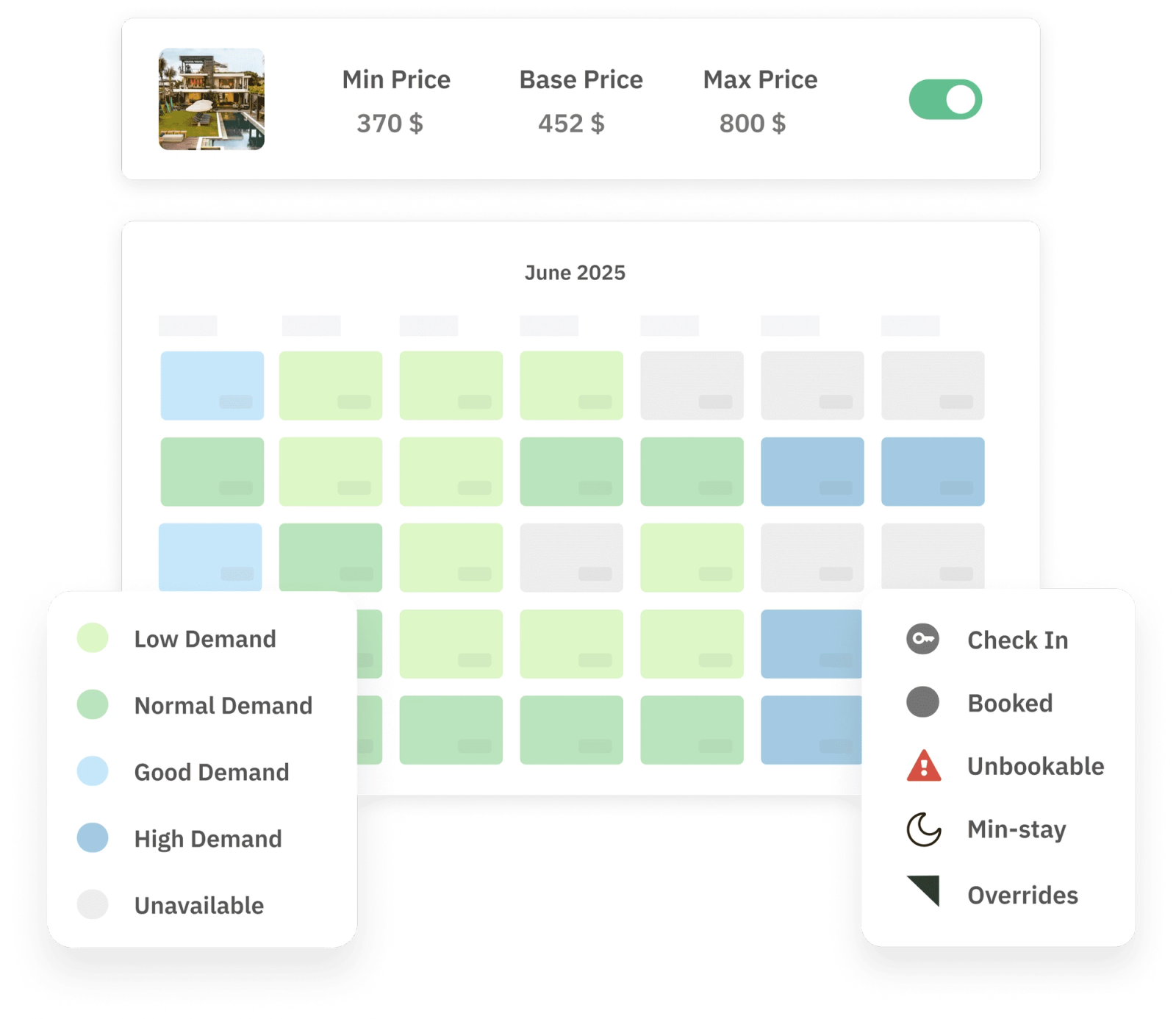
This is the value of comparing curves before reacting. PriceLabs' Hyper Local Pulse algorithm adjusts pricing to real-time market shifts automatically, but minimum stay and check-in rules still need a human check. Run this comparison monthly, and you catch restriction-driven slowdowns before an owner has to ask why the calendar looks empty.
A slow calendar is not automatically a soft market. Before you drop rates or worry about demand, compare your booking curve against the market curve for the same dates and comp set. Most of the time, the gap comes down to a minimum stay, a check-in rule, or a price that has not been checked against your comp set in a while.
Get that comparison right, and you stop discounting your way out of problems the market was never causing. PriceLabs Market Dashboards put both curves side by side, so the diagnosis takes minutes instead of guesswork.
A booking curve plots how far in advance guests reserve a property before check-in, showing the pace at which a calendar fills relative to lead time. Comparing it against a market curve for the same comp set shows whether your pacing is normal, ahead, or behind.
Pull your property curve and the market curve for the same dates side by side in Market Dashboards. If the market curve is healthy and yours lags behind at the same lead time, the cause is usually a property-level restriction rather than a real demand shift.
Long minimum stays, rigid check-in day rules, and blackout dates left over from a previous season are the most common causes. Each suppresses bookings independent of actual guest demand, and each shows up as a distinct pattern in the booking curve.
Monthly is a reasonable baseline for most portfolios, with a check any time occupancy or ADR moves outside its normal range for the season. Property managers handling dozens of units often build this into a recurring Portfolio Analytics review.
Yes. A longer minimum stay blocks any guest looking for a shorter trip from booking at all, which flattens the booking curve close to check-in even when demand for those dates is strong. Testing a shorter minimum stay on specific dates is one of the fastest ways to confirm this.
This builds on the broader concept of booking window and lead time, which the booking curve helps you visualize over time.
Reading the curve is also the foundation for forecasting future demand.
Want to learn what PriceLabs can do for you? See for yourself with a free trial. Get started now!