Get started with PriceLabs now!
Want to learn what PriceLabs can do for you? See for yourself with a free trial. Get started now!
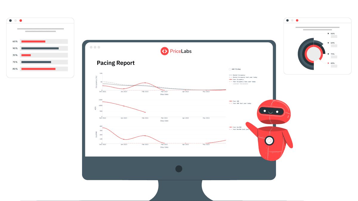
If you manage a short-term rental, the question you're actually trying to answer every week is simple: are my bookings ahead of or behind where they should be right now? Pacing reports exist to answer exactly that. They compare your current bookings, rates, and occupancy against last year and against your local market, so you know whether to hold your pricing, push it, or pull back, before the booking window closes and it's too late to act.
A pacing report tracks how your listing's key metrics, typically occupancy, average daily rate (ADR), and revenue per available rental (RevPAR), are building up for a future date compared to a reference point. That reference point is usually one of two things: the same period last year, or the current local market.

"Pacing ahead" means your bookings for a given date are coming in faster than that reference point. "Pacing behind" means they're coming in slower. Neither is inherently good or bad on its own. Pacing ahead of last year during a period when the whole market is up isn't a signal you're doing anything differently; pacing ahead of the market when the market itself is flat is a much stronger sign your pricing or listing is working.
That distinction, between pacing against yourself and pacing against the market, is what makes the data useful for decisions rather than just a status update.
A pacing curve plots one of your key metrics (occupancy, ADR, or RevPAR) over the booking window leading up to a stay date, typically shown as a percentage compared to the same point last year or against the market.
Here's how to read one in practice. Say you're looking at your pacing curve for a set of dates 60 days out:
Booking curves work the same way but track how bookings accumulate over the lead time to a stay date (for example, at 60, 30, and 7 days out), which helps you see not just where you stand today but whether the gap is closing or widening as the date approaches.
Pacing data shows up in three places, depending on what you're trying to see:
Use Portfolio Analytics if you want to see your own pacing data before committing to anything else. If you're setting up regular reporting around these tools for the first time, our dynamic pricing reporting checklist covers how pacing fits alongside occupancy, ADR, and lead-time data in a routine review.
Pacing data is only useful if it changes what you do. A few practical triggers:
The pattern that matters isn't a single day's number. It's whether the gap between you and your benchmark is widening, holding steady, or closing as the booking window shortens, which is the same principle behind reading short-term rental analytics more broadly: a snapshot tells you less than a trend does.
Pacing measures how your bookings, rates, or occupancy for a future date are building up compared to a reference point, usually last year or your local market, so you can catch demand shifts before the stay date arrives.
Compare your pacing curve against Market Dashboards or Neighborhood Data for the same period. If your listing is behind while the broader market is flat or up, that points to something specific to your listing rather than a market-wide slowdown.
A pacing curve is a chart showing how a metric like occupancy or ADR builds up over the booking window for a given stay date, typically plotted against the same period last year or the market average.
No. Pacing shows how your current bookings compare to a real historical or market benchmark right now. Forecasting projects where you're likely to end up based on models. Pacing is what grounds a forecast in what's actually happening.
No. Portfolio Analytics, which includes pacing reports, is available free, independent of a paid PriceLabs subscription.
Want to learn what PriceLabs can do for you? See for yourself with a free trial. Get started now!